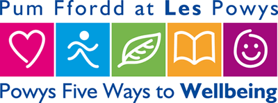
Five Ways to Wellbeing (Aneurin Bevan Health Board Campaign)
Aneurin Bevan Health Board wanted a logo developed to promote a new mental health initiative. The logo refelects the '5 Ways to Wellbeing' message and is bright, friendly and appeals to a wide target audience. The logo has been applied to a number of different regions.
Logo, branding, print, promotional material
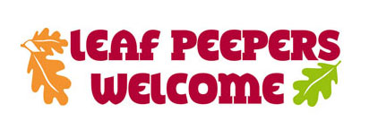
Leaf Peepers Welcome
Working with Forest of Dean & Wye Valley Tourism we designed a logo to work with their new "Leaf Peeping" campaign. A project to encourage footfall to the area during off-peak Autumn months. The project was a huge success.
Logo, literature

Precision Manufacturing Solutions
A manufacturing company, who wanted to update their existing logo. The 'p' from their name was merged with engineering elements from their range to create a strong, bold logo.
Logo, stationery, literature, signage
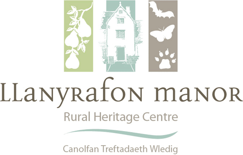
Llanyrafon Manor
Torfaen CBC wanted to develop a new logo and branding package for the launch of the refurbished Rural Heritage Centre. Morf Designs won the contract and developed a design reflecting the character of the new attraction. The branding has been applied to signage, interpretation panels, exhibition graphics, printed material, digital media and advertising to create a strong, unique identity.
Logo and branding guidelines package
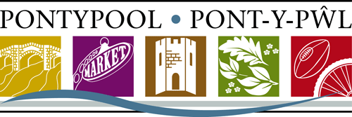
Pontypool
Morf Designs Ltd won the design bid to develop a new identity for Pontypool as part of the area's rebranding as a Market town destination. A comprehensive design guidelines package was developed through extensive research into the area and and a close working partnership with the project leaders and comittees was established.
The design was continued through a large range of marketing material.
Logo, extensive rebranding package
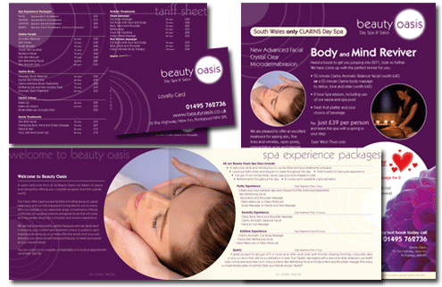
Beauty Oasis
Beauty Oasis wanted an updated simple, clean logo which could be used effectively throughout different media. A colour swatch was chosen using rich purple and natural tones. The updated identity continues through their new stationery, newsletter, brochure, salon signage and all advetising material.
Logo, stationery, shop signage, leaflets

Energy Awareness Campaign logo for Gwent Healthcare NHS Trust
The client required a logo to reflect their campaign of energy awareness. We used the blue to represent energy and the green as an environmentally friendly colour. The 'e' is containing the blue energy and together the two elements create an 'earth' style icon.
Logo, website, calendar, poster campaign

Phil James Upholstery
The client required a simplistic logo that would reproduce well when used on vehicle graphics, product branding etc. Being a furniture upholstery company we used the letter J from the company name to create an abstract chair. This was reversed out of a black box to create a simple, yet visually effective solution.
Logo, stationery, vehicle graphics

Chromis Consulting Ltd
A business psychology company, they wanted to create a friendly, approachable image for their company and with the owners passion for diving wanted to personalize the logo with the use of marine elements.
Logo, stationery, website, promotional literature

No. 6 Beauty Lounge
The client required an elegant logo for their beauty salon. We merged the side profile of a woman's face with the number six and using natural tones and a classic script font we created their identity.
Logo, stationery, shop signage, leaflets
back to top